
Most brand activations start with a brief that talks about “creating an experience.” The brief gets passed to a designer who selects materials based on budget, timeline, and whatever’s trending on Pinterest. The result is a space that looks like every other activation: white walls, neon signage, maybe some greenery if the brand skews wellness. Nobody in the room asked the question that actually matters: what should this space feel like against your skin?
Aradhna Krishna’s foundational work on sensory marketing at the University of Michigan established something the experiential industry still hasn’t fully absorbed: the senses don’t operate independently. Touch influences taste. Smell triggers memory with more precision than sight. Temperature changes emotional state. When we select materials for a brand environment, we’re not just choosing surfaces. We’re programming a neurological sequence that determines whether someone feels welcome, intimidated, curious, or calm.
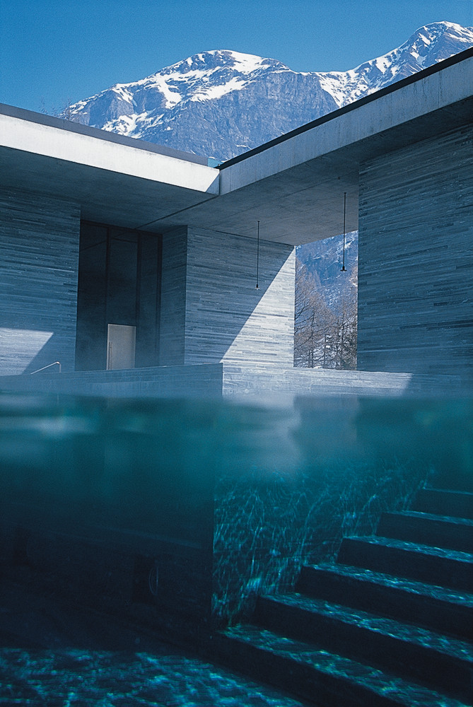
Architects have understood this for decades. Peter Zumthor doesn’t choose concrete because it’s cost-effective. He chooses it because of how it holds light at 4pm in November, how its thermal mass makes a room feel anchored, how its imperfections give a surface permission to age. The Therme Vals, his most studied project, works primarily through material: Valser quartzite, leather, brass, water at precisely controlled temperatures. You don’t experience that building through your eyes first. You experience it through your feet on stone, steam on your face, the particular way sound moves through a space where every surface was chosen for its acoustic properties.
The experiential marketing industry spends roughly $128 billion annually, and the vast majority of that investment treats material selection as a production decision rather than a strategic one. Materials get chosen in the last third of a project timeline, after the concept has been approved, the renderings signed off, and the budget locked. By then, the most important sensory decisions have been reduced to a line item.
We’ll spend three weeks debating a tagline that visitors will read for two seconds, then give a production manager forty-eight hours to source the materials that visitors will touch, smell, and physically inhabit for twenty minutes. The priorities are inverted.
The Body Knows Before the Mind Does
Neuroscience research from Antonio Damasio and others has demonstrated that emotional processing often precedes conscious thought. The somatic marker hypothesis suggests our bodies register environmental cues and generate feeling-states before our prefrontal cortex has time to form an opinion. This has direct implications for experiential design: the materials surrounding a visitor are communicating with their nervous system before they’ve read a single piece of signage.
This isn’t metaphor. It’s measurable. Studies on haptic perception show that the weight and texture of objects in your hands influence your judgment of unrelated concepts. Heavy clipboards make resumes feel more substantial. Rough textures make social interactions feel more adversarial. If holding a rough object changes how you perceive a conversation, imagine what standing in a room made of cheap foam core does to your perception of a brand.
Tadao Ando understood this when he built the Church of the Light using nothing but concrete and a cross-shaped slit that admits a blade of sunlight. There is almost nothing in that room. The material is the message. The concrete is cold, raw, monastic. It tells your body that you are in a serious place before your mind has processed the architecture.
The brands that get this right tend to work with people who think about space the way architects do. OutThere Lab, run by Gemma Roper, is one of the few firms in the experiential world that approaches material selection with the rigor of a design practice. Their work treats surfaces, textures, and environmental conditions as primary design decisions, not afterthoughts.
Materials as Identity
Some brands have figured out that their material palette is as important as their color palette. Walk into an Aesop store in Melbourne and one in Tokyo, and the products are the same, but the spaces feel entirely different because they’re built from locally sourced materials that respond to their specific context. The Melbourne flagship might use reclaimed timber and raw steel. The Tokyo store might use hinoki wood and hand-finished plaster. Both feel unmistakably like Aesop because the material logic is consistent even when the materials themselves change: natural, warm, honest, slightly austere.
Aesop may be the clearest example of a brand that uses materiality as identity rather than decoration. Their stores aren’t designed to look good on Instagram, though they do. They’re designed to feel a certain way when you walk in. The air smells like product because the architecture is designed to hold scent. The surfaces invite touch because the finishes are tactile. The lighting is warm because the materials are chosen to absorb and diffuse light rather than bounce it. This is sensory design operating at a strategic level.

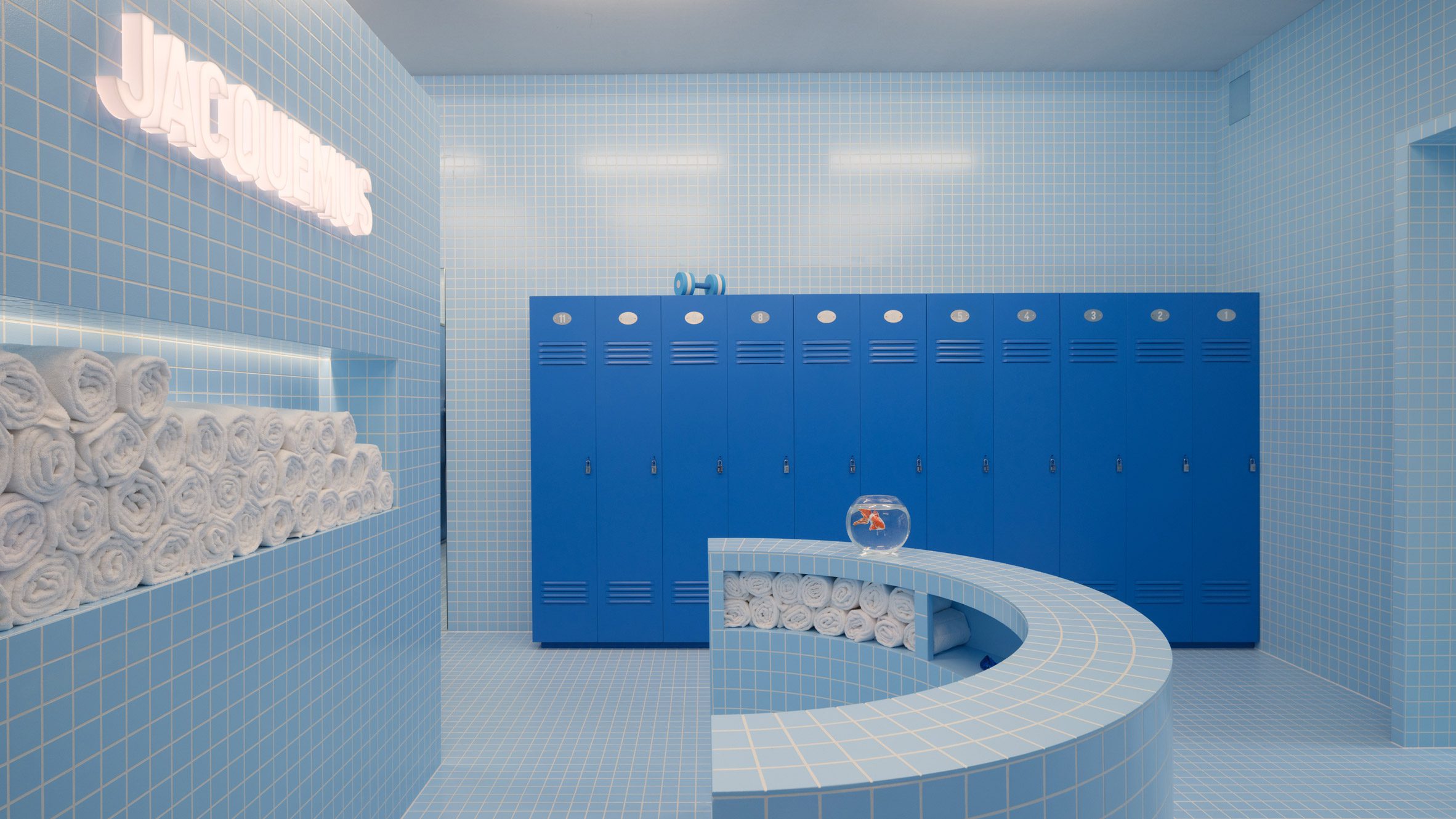
Jacquemus takes the opposite approach and makes it work. Their pop-ups are aggressively artificial: oversized objects, surreal proportions, hyper-saturated color. The materials are often cheap and temporary, but deployed with such theatrical confidence that the artificiality becomes the point. A giant pink handbag vending machine doesn’t work because of material quality. It works because the material choices, glossy plastic, bold pigment, smooth surfaces, match the brand’s personality with absolute precision. The lesson isn’t that expensive materials are better. The lesson is that intentional materials are better.
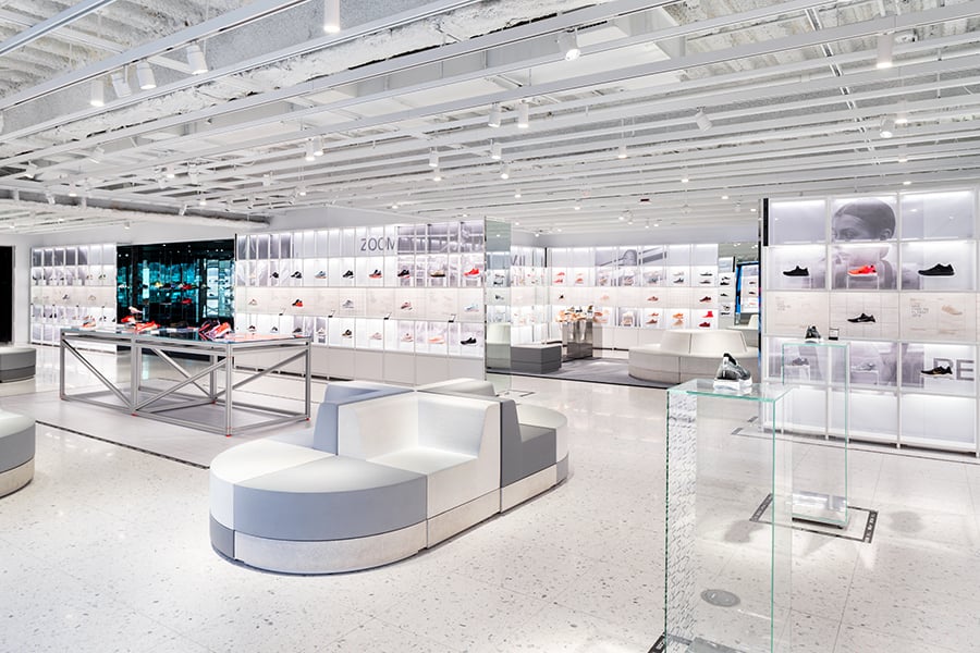
Nike’s House of Innovation stores use a material vocabulary of glass, steel, and poured concrete that deliberately echoes the architecture of sports facilities. The exposed ductwork and industrial finishes aren’t an aesthetic accident. They’re a material argument that this brand is built for performance, not luxury. When Nike wants to signal luxury, as in their Bespoke iD studios, the material palette shifts to leather, walnut, and brushed metal. Same brand, different material argument, different feeling in the body.
Materials Have Timestamps
Here’s something the architecture world discusses openly that the experiential industry mostly ignores: materials carry temporal associations. They place a space in time whether you intend them to or not.
Glass block reads as 1980s. Exposed brick reads as early-2010s Brooklyn. Terrazzo reads as 2018-2022. Fluted glass reads as 2020-2023. Cane webbing reads as 2019-2021. Each of these materials had a moment when it signaled freshness, and each has since accumulated enough cultural repetition to signal something closer to trend fatigue.
Terrazzo made a massive comeback around 2018, driven by its photogenic qualities and historical associations with mid-century Italian design. For about three years, it was everywhere: retail spaces, restaurant floors, product packaging, iPhone wallpapers. By 2022, specifying terrazzo in a project was no longer a design choice. It was a signal that your references were two years old.
This is the politics of materials. Choosing a surface isn’t just an aesthetic decision. It’s a temporal claim. It says: this is when we built this, this is what we thought was important, this is which cultural conversation we wanted to enter. The brands that navigate this well tend to reach for materials with longer cultural half-lives: raw wood, natural stone, metals that patina, textiles with genuine craft provenance. These materials don’t expire because they were never trending. They were just good.

The best material choices reference something older than the current moment without feeling nostalgic. They create spaces that feel simultaneously familiar and unplaceable, which is the sweet spot for brand environments that need to last longer than a single season.
When Materials Serve the Camera Instead of the Body
There’s a version of material thinking that has become dominant in experiential marketing, and it’s almost entirely visual. Spaces designed for content capture prioritize how materials photograph rather than how they feel. The result is environments that are optimized for a two-dimensional representation of a three-dimensional experience.
The Museum of Ice Cream’s environments are designed with extraordinary visual intelligence. Every color, surface, and object is calibrated for the camera. But stand in one of those rooms and the sensory experience is thin: synthetic materials, climate-controlled air that smells like nothing, surfaces that feel like what they are, which is painted plywood and injection-molded plastic. The Instagram post is the experience. The room is just its container.
This isn’t a criticism of MOIC’s business model, which is brilliant. It’s an observation about what gets lost when material selection serves only the visual channel. The bodily experience, the thing that creates genuine memory, gets optimized away.
Krishna’s sensory marketing research is instructive here: multisensory experiences create stronger memories and more positive brand associations than single-sense experiences. A space that looks good and feels good will outperform a space that only looks good, even in metrics that the visually-optimized space was designed to win, like social sharing and return visits.
The Argument for Impermanence
Experiential design is inherently temporary, and this temporality should be treated as a feature rather than a constraint. The knowledge that something won’t last changes how we experience it. Cherry blossoms aren’t beautiful despite their brief season. They’re beautiful because of it. The Japanese concept of mono no aware, the bittersweet awareness of impermanence, has direct applications for experiential design.
When Early Spring produced the Bloom Glacier Crush launch activation, the entire concept centered on ice as a primary material. Not ice as decoration or backdrop, but ice as the structural and emotional core of the experience. Twelve-foot sculptural ice formations, frozen botanical specimens, surfaces that were literally melting throughout the event.

Ice is the most aggressive material choice you can make in experiential design because it has a built-in expiration. It forces urgency. It makes the experience unrepeatable in the most literal sense: the activation you visit at 2pm is physically different from the one that exists at 5pm. The surfaces are changing. The light moves through them differently as they thin. The temperature of the space shifts. You can’t come back tomorrow and have the same experience because the material won’t allow it.
The decision to launch an outdoor activation using ice sculptures in early spring wasn’t just theatrical. It was a material argument about freshness, immediacy, and the relationship between a product and its environment. The ice didn’t represent the brand. It performed the brand’s core promise: this is cold, this is fresh, this is happening right now.
Moving Materials into Strategy
The experiential marketing industry spends significant portions of its budgets on content creation, technology integration, and celebrity appearances, then allocates material selection to the production phase where it competes with logistics, permitting, and electrical. This sequence produces spaces that are conceptually ambitious and materially generic.
Material selection belongs in the strategy phase, alongside audience research, brand positioning, and concept development. The question “what should this space be made of?” is as strategically important as “what should this space say?” In many cases, it’s more important, because materials communicate faster and more honestly than language.
Zumthor doesn’t select copper cladding for the Kolumba Museum because it matches the brief. He selects it because copper changes color over decades, and a museum built to house a two-thousand-year history of art should be clad in a material that itself shows the passage of time. The material is the strategy.
The practitioners who think this way, architects like Kengo Kuma, designers like Ilse Crawford, brands like Aesop, produce work that ages well and performs well because the material decisions reinforce every other decision. The concept, the brand message, the spatial experience, and the physical surfaces are all saying the same thing.
In a discipline obsessed with content, the most powerful content might be the thing you’re standing on.